TV Menu Board
Use this page to put your menu on an in-store TV or monitor. It keeps itself up to date as you change products and prices.
Quick steps
- Turn it on once: Settings > Edit Settings > Sales & Integrations > Digital Menu Boards, tick Enable Digital Menu Boards and click Update Settings.
- Go to Products > More Actions > Menu Boards. Click New Template (or Load Default Templates on an empty page), pick the Categories this screen should show, and click Create Template.
- Click Preview on the template to open the board, and open that same address on the TV's browser. Sign in there as an admin or manager.
- Tap the small Edit button in the bottom-right corner, change the colours, fonts and what's shown, and click Save.
- Press F11 for full screen.
Make one template per TV, and click Own look on each template before you style it — otherwise every TV shares one design.
Common questions
The board says Menu Board Unavailable. Check Enable Digital Menu Boards is on and you have at least one active template.
I don't see the Edit button. It only shows for a signed-in admin, manager or owner. Sign in on that device.
How quickly do price changes show? On the next refresh — every 5 minutes unless you change the template's Refresh Interval. Reload the page for an instant update.
The text is too small. In edit mode, set Font Size to 100%. That fills the screen.
Products are missing. Out-of-stock and inactive products are hidden, unless you turn on Show out-of-stock products.
More detail: how it works, the board's address and where to put the screen
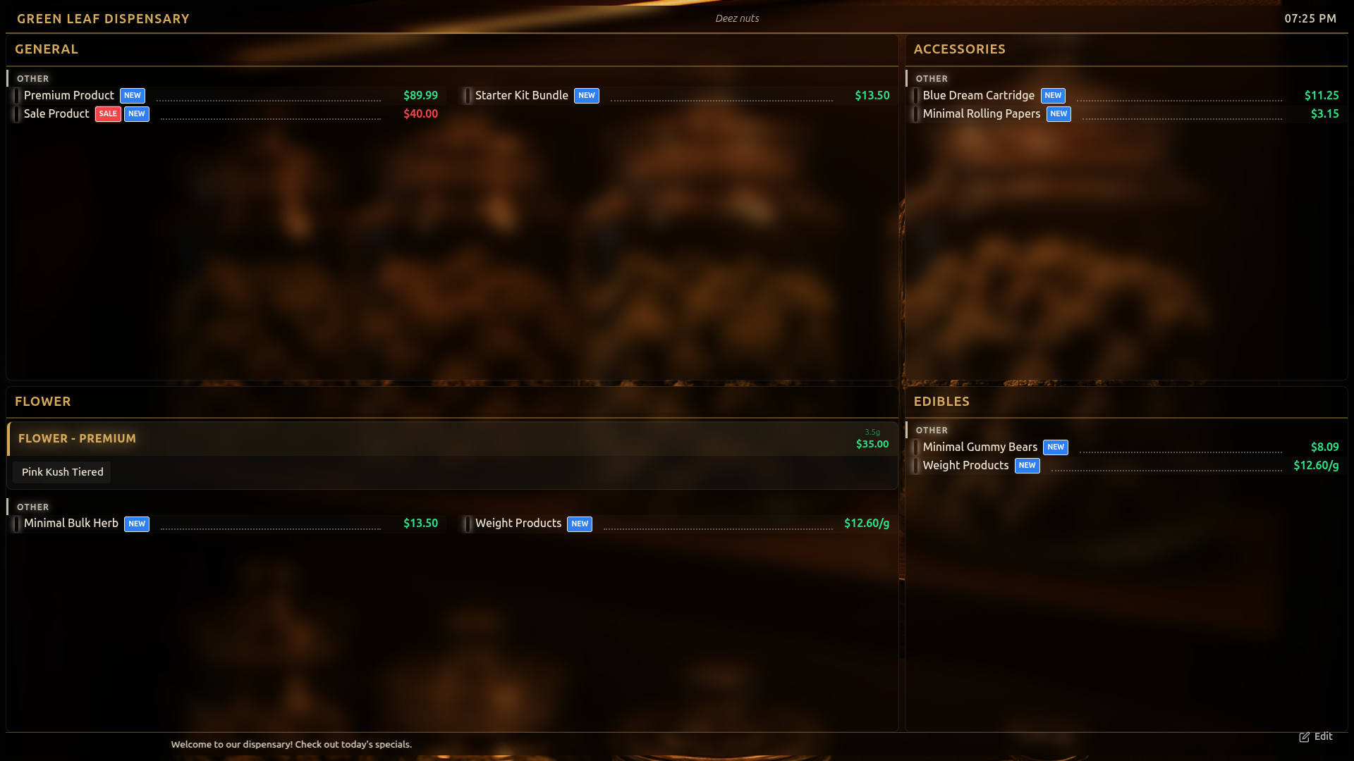
The TV Menu Board is a full-screen digital display designed to show your product catalog on in-store TVs, monitors, or tablets. It is especially popular in cannabis dispensaries where customers review the menu while waiting. Products, prices, strain types, pricing templates, and badges update automatically as you make changes in the admin panel — no manual refresh needed.
Turn on Enable Digital Menu Boards under Settings → Edit Settings → Sales & Integrations → Digital Menu Boards, then click Update Settings. Until it is on, the display shows Menu Board Unavailable and the Menu Board Templates page is not available.
How It Works
The TV Menu Board is a dedicated web page served directly from your Brother POS instance. You open the URL on any display device with a web browser and it runs continuously. Products are organized into category cards, and the board works out for itself how many columns to use and how big the type can be so that the whole menu lands on the screen.
Key characteristics:
- No special software — Any device with a modern web browser works (Chrome recommended).
- It fits itself to the TV — The board measures the screen, packs the category cards down the columns, and picks a type size that fills the screen without pushing anything off the bottom. A short menu gets bigger type rather than a half-empty screen. See How the Board Sizes Itself.
- Paging only when it has to — If the menu is genuinely too big to fit even at the smallest readable size, the board falls back to cycling products through the columns. On most boards nothing cycles at all.
- Auto-refreshing — Product data refreshes periodically from the server (configurable interval, default 5 minutes). If nothing has changed, the board leaves the layout exactly where it is — it does not re-measure or resize itself on the wall.
- Built-in editor — Tap the Edit button directly on the display to open a settings panel. No admin panel needed. The Edit button only appears when a logged-in admin or manager is viewing the board (see Edit Mode).
- A look per screen — Each TV can wear its own colours, fonts and sizes, so tuning the concentrates board does not change the flower board. See Giving a Screen Its Own Look.
Accessing the Menu Board
Open the following URL on your display device:
https://yourstoreurl.brotherpos.ca/pos?display=menu-board
Replace yourstoreurl.brotherpos.ca with your actual store URL.
To load a specific template, add the template parameter:
https://yourstoreurl.brotherpos.ca/pos?display=menu-board&template=<template-id>
If no template is specified, the default template is used. The easiest way to get a template's link is to click Preview on its card on the Menu Board Templates page and copy the address from the tab that opens.
Press F11 on the display device's keyboard to enter full-screen mode and hide the browser toolbar. For a completely clean display, use Chrome's kiosk mode: chrome --kiosk --app=https://yourstoreurl.brotherpos.ca/pos?display=menu-board
Positioning the Display
Mount or position the screen where customers can see it easily:
- Behind the counter, facing customers.
- In the waiting area.
- At the entrance for walk-in browsing.
- On a wall-mounted TV visible from the sales floor.
Quick Setup
- Switch on Enable Digital Menu Boards (see above).
- Make sure you have at least one template. On the Menu Board Templates page, click New Template, or Seed Defaults (Load Default Templates when the page is empty) to add the starter templates. With no template, the board shows Menu Board Unavailable.
- Open the menu board URL on your TV or monitor (signed in as an admin or manager so the Edit button appears).
- Tap the small Edit button in the bottom-right corner to enter edit mode.
- If your store has saved looks, pick one from the Profile dropdown to start from.
- Adjust any settings you want (colors, fonts, toggles).
- Click Save to apply your changes.
- Press F11 for full-screen mode.
That is all you need. The board is now live and will keep itself updated.
Before you start tuning colours and sizes on a second screen, give that screen its own look first — otherwise both TVs are sharing one design and every change you make on one shows up on the other. See Giving a Screen Its Own Look.
More detail: templates, categories and giving each screen its own look
Template Management
Templates hold a screen's timing and which categories it shows, and each one also decides which look its screen wears. Admins and managers manage templates on the Menu Board Templates page. To get there, go to Products → More Actions → Menu Boards (under Menus & Displays), or Settings → Edit Settings → Sales & Integrations → Digital Menu Boards → Manage Templates.
Think of it as one template per TV: the template is the screen's identity, the look is its styling.
Template Settings
Each template stores:
| Setting | Description |
|---|---|
| Name | A descriptive name for the template (e.g., "Main Floor TV", "Waiting Area"). Each name can only be used once. |
| Description | Optional notes about the template. |
| Layout, Transition, Orientation, Dimensions | Saved with the template and shown on its page. The TV menu board works out its own layout from the screen it is on, so these do not change how the board looks. |
| Page Duration | How many seconds each page shows when a category has more products than fit and cycles through them (at least 3; new templates start at 10). |
| Refresh Interval | How often product data refreshes from the server, in seconds (at least 30; new templates start at 300, or 5 minutes). |
| Categories | Which product categories to display (see Category Priority below). The picker shows your categories as a tree, with subcategories nested under their parent, so you can put a subcategory — or a sub-subcategory such as Flower > Indica > Premium Indica — on a screen by itself. When you edit an existing template's categories, the ones already on the board are listed first, in their saved order. |
| Theme Colors, Product Card Display | Shown on the template's page for reference only. To change colours, use the board's Edit panel. |
Creating a Template
- Go to the Menu Board Templates page.
- Click New Template.
- Fill in the Template Name, timing, and Categories for this Template.
- Click Create Template.
To style the screen, open it with Preview and use the board's own Edit button.
Editing a Template
Each template card has:
- Categories — Opens the template's page. Click Edit Categories there to change which categories it shows, then Save Categories.
- Edit — Opens the live menu board for that template with the edit panel already open, so you can change its look straight away (see Edit Mode).
Other Actions
- Preview — Opens the menu board display with that template loaded in a new tab.
- Duplicate — Creates a copy of the template with "(Copy)" appended to the name.
- Set Default — Makes the template the default (marked with a star). The default template is used when no
templateparameter is specified in the URL. - Delete (red bin button) — Removes the template. The default template has no Delete button — set a different template as default first.
- Seed Defaults — Adds the starter templates: Cannabis Grid, Retail Carousel, Simple Price List, Minimal Modern and Restaurant Menu. If one of those already exists, it is reset to its original settings.
Category Priority
The menu board uses a three-layer priority system to determine which categories to display:
- Store-level filter (highest priority) — If a store-wide category list is set, it is used for every template. See Getting Out of a Store-Wide Category Filter if this is not what you want.
- Template-level filter (medium priority) — If the store has no category filter, the template's own category assignments are used (set when creating or editing a template).
- All categories (fallback) — If neither the store nor the template specifies categories, all active top-level categories are displayed.
Each template card on the admin page shows how many categories it will display and, in brackets, where that list came from:
- (store filter) — The store-wide list is in charge, and this template's own categories are being ignored.
- (template) — This template has its own category list.
- (all) — No filter; every active top-level category is shown.
For quick per-screen filtering without changing template settings, you can also use the categories URL parameter (see Multi-Screen Setup). The URL parameter filters on top of whatever the priority system resolves.
Getting Out of a Store-Wide Category Filter
The store-wide list beats every template, so while it is set, every TV shows the same categories no matter which template it loads — which means per-TV menus stop working.
When that list is set, an amber banner appears at the top of the Menu Board Templates page:
A store-wide category filter is overriding every template
The banner lists the categories that are locked in and gives you a Clear filter button. Clearing it hands every template its own categories back. Nothing else is changed — your templates, looks and category assignments are untouched.
On older versions, pressing Save in edit mode on any screen wrote that screen's category list store-wide. If one TV was set up to show only Edibles, saving from it switched every other TV to Edibles too. That no longer happens (see Multi-Screen Setup), but if your boards were caught by it, Clear filter is the way back.
Giving a Screen Its Own Look
A template controls the structure of a board — resolution, timing, and which categories it shows. A look (also called a profile) controls the design: colours, fonts, sizes, effects, backgrounds and toggles.
By default every template shares the store's default look, so a change on one TV changes them all. Each template card on the Menu Board Templates page has a Look panel showing which one it wears:
| What the card says | What it means |
|---|---|
| store default (shared) | This screen shares its design with every other screen on the default look. Editing this board changes them too. |
| A look's name | This screen has its own colours and sizes. Editing it leaves the other screens alone. |
To give a screen its own design, click Own look on its card. That copies whatever the board is currently wearing into a new look named after the template, so the TV carries on looking exactly the same — and from then on, editing it only affects that TV.
Use the dropdown in the same panel to point a template at any existing look, or back at Store default. Two templates can deliberately share one look where the branding should match — just pick the same one for both.
If you delete a look, any board wearing it simply falls back to the store default. Nothing breaks.
More detail: design profiles
Design Profiles
Profiles (looks) store all your visual customization settings (colors, fonts, effects, background, toggles, hidden products, etc.) and can be switched instantly. Stores that have the preset looks loaded can start from one of these five:
| Profile | Style | Description |
|---|---|---|
| Emerald Luxe | Premium dark emerald with gold accents | Playfair Display headers, glass morphism, accent strips, price glow. Art Deco Gold background image. |
| Neon Nights | Cyberpunk neon glow | Bebas Neue headers, full neon mode with header and price glow, scrolling ticker. Retro neon grid background. |
| Dark Walnut Gold | Warm wood and gold luxury | Cinzel headers, Cormorant Garamond body, leader dots, accent strips. Dark walnut wood background. |
| Purple Haze | Deep purple and violet mystique | Oswald headers, Raleway body, glass morphism, header and price glow, scrolling ticker. Purple haze atmosphere background. |
| Forest Canopy | Natural, organic earth tones | Merriweather headers, leader dots. Misty forest background. |
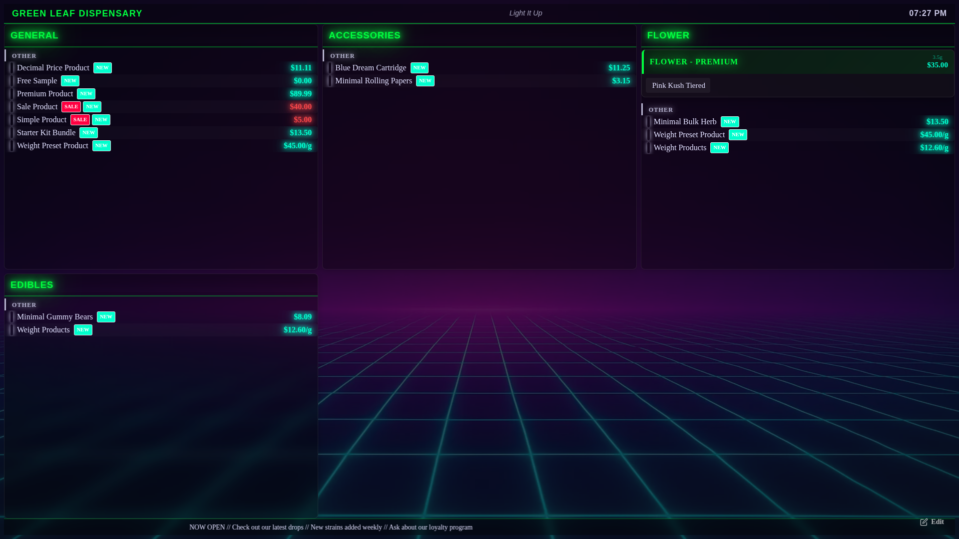
If the Profile dropdown only shows No profile, there are no saved looks yet. Adjust the board and press Save — the settings are kept as your store's default look.
Managing Profiles
In edit mode:
- Select a profile — Choose from the Profile dropdown. The display updates immediately.
- Create a new profile — Click + New, enter a name, and click Create. Your current settings are saved to the new profile.
- Modify a profile — Make changes in edit mode while a profile is selected, then click Save. The changes are written to that profile.
- Switch profiles — Select a different profile from the dropdown. The display loads that profile's settings.
Which profile a screen wears, in order:
- The look bound to the template the screen is loading (set on the Menu Board Templates page — see Giving a Screen Its Own Look).
- A profile picked by hand on that device.
- The store's default profile.
Save in edit mode writes to whichever of those the screen is actually wearing. So on a board with its own look, saving only changes that board; on a board still on the store default, saving changes every other board still on the store default.
More detail: every setting in edit mode
Edit Mode
Tap the Edit button in the bottom-right corner to open the settings panel.
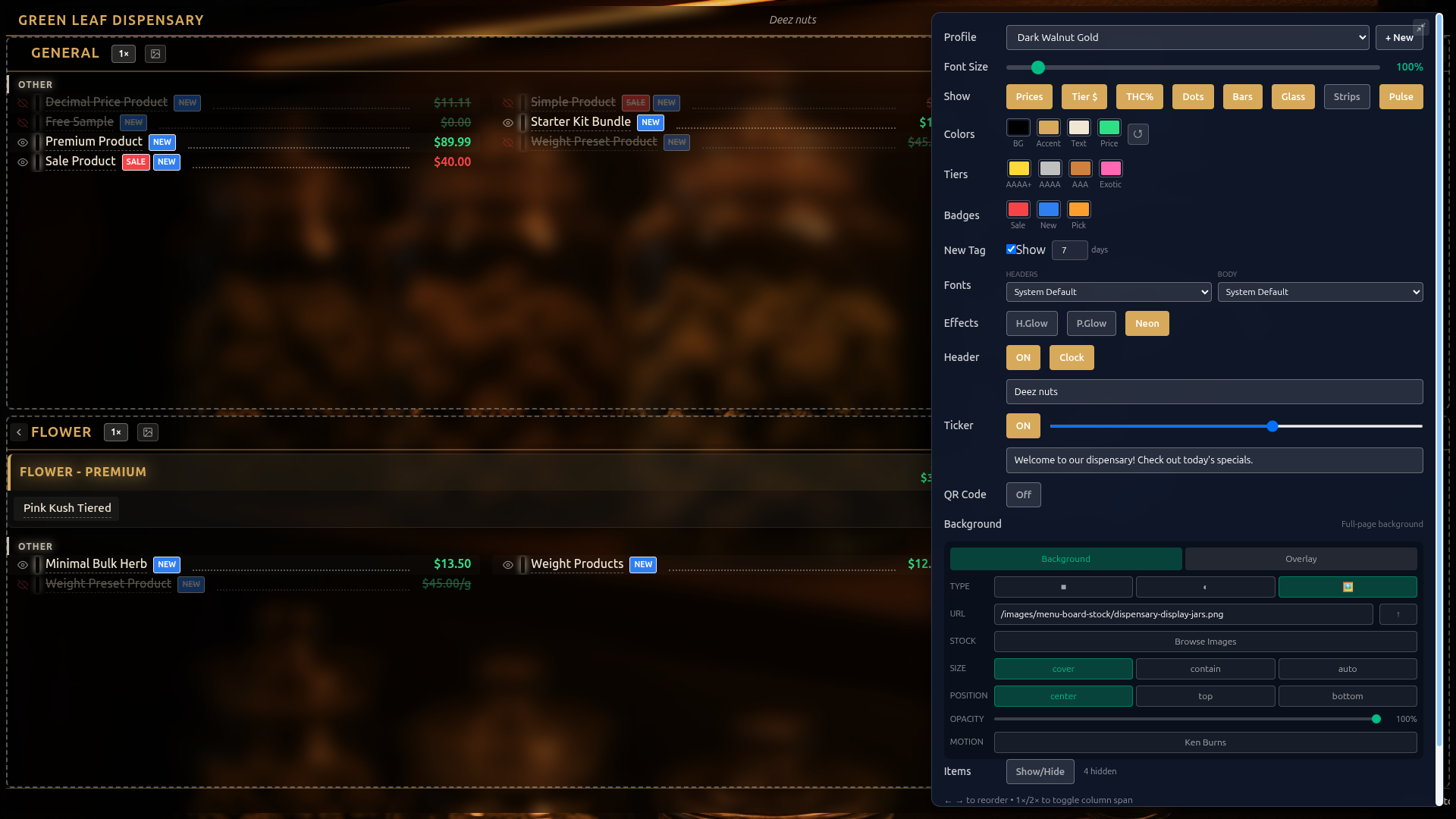
The menu board display URL is public so any TV can render it without logging in, but editing is not open to everyone. The Edit button only appears when the person viewing the board is a signed-in admin, manager or owner of that store — either signed into the POS register on that device, or signed into the admin in that browser. A plain display screen with nobody signed in never sees the Edit button, and changes from an unauthorized device are rejected anyway. A manager of one store cannot edit another store's board.
The edit panel provides the following controls:
Font Size
The board already works out the largest type that fits the screen. The Font Size slider says how much of that to use: 100% fills the screen, and lower values leave more empty space around the menu. The range runs from 30% to 100%.
Because it is a share of the fill rather than a fixed point size, the same 100% setting looks right on a 43" screen and on a 75" one — each fills its own screen. And because it is capped at the fit, no setting can push products off the edge.
Leave the slider at 100% unless you deliberately want the menu to sit smaller with air around it. If the type feels too big, the answer is usually more categories on the board or Page Rotation, not a lower Font Size.
This slider used to mean an absolute text size and went up to 500%, where anything above the fill point did nothing at all. It was changed to a share of the screen, and because the old numbers do not translate, every existing look was reset to 100% — which fills the screen. Drag it back down if you preferred your board smaller.
Field Sizes
Below the master Font Size slider, the Field Sizes group gives each text field its own size multiplier so you can fine-tune the hierarchy without touching everything at once. Each multiplier is relative to the Font Size slider and ranges from 50% to 300% (100% = no change):
| Field | What It Scales |
|---|---|
| Name | Product / strain names and tier chip names. |
| Price | All prices, including the weight-based tier price grid. |
| THC | THC / CBD percentages. |
| Category | Category headers and section labels. |
| Variations | The little price chips under a variable product's name (e.g. 500mg $15 1000mg $25). |
For example, bump Name to make strain names read from across the room while leaving prices and headers where they are. Existing boards are unaffected — every multiplier defaults to 100%.
Show/Hide Toggles
The Show row has toggle buttons that control what information appears on the board. THC% and Bars only appear for stores with cannabis features turned on.
| Toggle | What It Controls |
|---|---|
| Prices | Show or hide product prices. Until you touch it on a given board, it follows Show prices under Settings → Edit Settings → Sales & Integrations → Digital Menu Boards; once you press it on a board, that board makes its own decision from then on. |
| Tier $ | Show or hide pricing template weight-based pricing (e.g., 3.5g, 7g, 14g columns). |
| Tier Label | Show or hide the quality-tier label (e.g., "Diamond Infused Flower") above each price grid. Turn it off for boards whose big category header already names the tier, so the label is not duplicated. Default on. |
| Sections | Show or hide the small section eyebrow labels (e.g., "VALUE", "MID SHELF") above category headers. Turning it off reclaims a line of vertical space per column. Default on. |
| THC% | Show or hide THC percentage on products. |
| Dots | Leader dots — dotted lines connecting product names to prices for readability. |
| Bars | Strain type color bars on the left edge of each product row. |
| Glass | Glass morphism effect — frosted glass appearance on category columns. Works especially well with image backgrounds. |
| Strips | Accent color strips on the left edge of category headers. |
| Pulse | Animated pulse effect on SALE badges to draw attention. |
Colors
Color pickers for the core display colors:
- BG — Background color (used when no background image is set).
- Accent — Category headers, active toggle highlights, and accent elements.
- Text — Primary text color for product names and labels.
- Price — Price text color.
- Weight — The weight label in a weight-price band (the
⅛,¼,½,OZpart).
Click ↺ (Reset to defaults) to go back to the default colours.
The weight used to take the price colour, so a band ran together as one unbroken line — ⅛ $20.00 ¼ $40.00 ½ $75.00 OZ $150.00 — and a category with three tiers was three of those stacked on top of each other. Weight now defaults to the theme's softer secondary text, which pushes the label behind the number so the pairs separate at a glance. Use the Weight swatch if your palette wants something different.
Tier Colors
The Tiers row has color pickers for pricing template badges: AAAA+, AAAA, AAA, and Exotic. These control the color of tier name labels in the tiered pricing sections.
Badge Colors
The Badges row has color pickers for product badges: Sale (on-sale items), New (recently added), and Pick (staff pick).
NEW Badge Control
In the New Tag row:
- Show checkbox — Enable or disable NEW badges on recently added products.
- days box — How many days after creation a product is considered "new" (1–90, default 7).
Products added within 30 days of your store's very first product (your opening catalog, or everything from your first import) don't get the NEW badge, so a new store's whole menu isn't badged. The online storefront follows the same rule.
Fonts
Two dropdown selectors for Google Fonts:
- Headers — Font for category names and section headers.
- Body — Font for product names, prices, and other text.
Available fonts: System Default, Playfair Display, Bebas Neue, Oswald, Montserrat, Raleway, Merriweather, Lato, Roboto Slab, Cinzel, and Cormorant Garamond.
Text Effects
- H.Glow — Adds a glow effect to category headers.
- P.Glow — Adds a glow effect to prices.
- Neon — Full neon text rendering mode. Best paired with a dark background for a modern dispensary aesthetic.
Header Bar
An optional bar across the top of the display showing:
- Store name — Your store's name.
- Tagline — Custom text (e.g., "Premium Cannabis, Curated for You").
- Clock — Live clock showing the current time.
Toggle the header bar on/off, toggle the clock independently, and enter your tagline text.
Scrolling Ticker
An optional scrolling text bar at the bottom of the display for announcements:
- Toggle on/off.
- Enter the ticker text (e.g., "NOW OPEN // Check out our latest drops // New strains added weekly").
- Adjust scroll speed with the slider (10s to 60s for one full cycle).
QR Code Overlay
Display a QR code on the menu board so customers can scan and browse your online menu on their phone:
- Toggle on/off.
- Auto (the default) — The QR code opens a browsable menu built from your products, so customers can scroll your full menu on their phone.
- Custom — Enter your own URL for the QR code to open (e.g., your online store).
- Position — Bottom Right, Bottom Left, Top Right, or Top Left.
- Size — Slider from 80px to 200px.
- Label — Text displayed with the QR code (starts as "Scan to Browse").
Background
Full-page background controls. On the Background tab, pick the Type with its three buttons:
- ■ Solid color — A single background color.
- ◐ Gradient — Linear or radial gradient, with an angle for linear, and two to four colors.
- 🖼 Image — A background image from the stock library, your own image, or a web address.
When using an image background:
- URL — Paste an image address, use the ↑ button to upload an image from the device, or click Browse Images to pick from the stock library.
- Size — cover, contain, or auto.
- Position — center, top, or bottom.
- Opacity — 0% to 100%.
- Motion: Ken Burns — Slow, cinematic pan-and-zoom animation on the background image.
The Overlay tab adds a color or gradient layer on top of the background image to improve text readability. Turn it ON, then choose:
- Solid — A single color at adjustable opacity.
- Gradient — A gradient at adjustable opacity.
- Blend — Normal, Multiply, Screen, Overlay, Darken, Lighten, Color Dodge, Color Burn, Hard Light or Soft Light.
Per-Category Backgrounds
Each category column can have its own background image. In edit mode, click the image icon button (Set background) on a category header to open the same background editor for that category, then click Done. This lets you show a flower photo behind the Flower column, an edibles photo behind Edibles, and so on.
Safe Area (Overscan)
Many TVs crop the edges of the picture (overscan), which can clip menu content. Rather than asking you to change the TV's picture settings, the menu board insets its content from each screen edge by a configurable amount. The fixed background layers still cover the full screen, so the cropped band becomes empty margin instead of clipped menu — there is no black border.
The Safe Area slider ranges from Off (0%) to 8% per edge, with a default of 3%. The row-fit math accounts for the inset automatically, so columns reflow to stay inside the safe area. Set this once at install for the specific TV and leave it.
Screen Care (Anti Burn-In)
Static menu content is the worst case for OLED burn-in and LCD image retention. Two screen-care protections are set per look, in the Pixel Shift and Off-Hours Dim rows of the edit panel:
- Pixel Shift (toggle, default ON) — Nudges the whole board through a small ±3px ring every 90 seconds with a slow transition. A slight overscan hides the bare edge so the shift is invisible to viewers. Recommended for any always-on display.
- Off-Hours Dim (toggle, default off) — Fades a black scrim over the board during your store's closed window. Set a Closed from and Reopens at time (they start at 22:00 and 09:00, and the window may cross midnight). The Brightness slider (0–50%) sets the residual brightness during off hours — 0% (shown as Black) is fully black. Dimming is suppressed while in edit mode.
Pixel Shift is invisible to customers and meaningfully reduces burn-in risk on always-on panels. There is no reason to turn it off unless you are troubleshooting.
Page Rotation
For boards with more categories than comfortably fit on one screen, Page Rotate splits categories across multiple pages and cycles the whole board through them, instead of cramming every category onto one screen.
In the Page Rotate section of the edit panel:
- Toggle the feature ON / OFF (default off).
- sec/page — How long each page is displayed before advancing (5–120 seconds, default 30).
- Assign each category to a page — Each category gets a Page number (1–9). Categories sharing a page number appear together and fill the grid on that page.
When rotation is live, a countdown indicator appears centered in the header: page dots show which page of how many is showing, plus a progress bar that fills over the dwell time so viewers (and you) can see a swap coming.
Editing one page at a time: When Page Rotate is on, auto-rotation pauses in edit mode and the panel shows an Editing: Page 1 / Page 2 / ... switcher. Pick a page to preview just that page's categories exactly as they will appear, so you can tune spacing, column spans, and order per page. The category-to-page assignment list stays visible so you can reassign while previewing. Live (non-edit) rotation is unaffected.
Items (Show/Hide Products)
Click Show/Hide to expand a list of all products organized by category. Uncheck individual products to hide them from the display. Hidden product count is shown next to the button.
Column Controls
In edit mode, each category card shows control buttons in its header:
- Left/Right arrows — Move the category.
- 1x / 2x — Toggle the category between normal width and wide.
What they do depends on which layout the board is using:
| Layout | Left/Right arrows | 2x |
|---|---|---|
| Whole menu fits on one screen (the usual case) | Move the category one place earlier or later in the running order. Cards flow down one column and into the next, so this is what decides where a card lands. | The card runs across the full width of the board. |
| Cycling layout (menu too big for one screen) | Nudge the category to a different column. | The card takes two columns. |
Press Save to keep the new order and widths.
Grid (Manual Columns and Rows)
Further down the panel, below Page Rotate, the Grid row lets you override the cycling layout by hand for the page you are looking at: type a number into Cols and/or Rows. Leave them blank (A = auto) to let the board decide, which is almost always the right answer. If Page Rotation is on, the label tells you which page you are setting.
Product Display Name Overrides
In edit mode, click on any product name to edit its display name. Press Enter (or click away) to keep it, or Esc to cancel. The new name is saved straight away. It changes how the product appears on the menu board — it does not rename the product itself.
Save and Cancel
- Save — Saves the look settings and, on the main unfiltered board, the category order, then exits edit mode.
- Cancel — Reverts the look settings and category order to the last saved state and exits edit mode. (Display name changes were already saved when you made them.)
More detail: the stock image library
Stock Image Library
Brother POS includes a library of 230 optimized WebP images designed specifically for menu board backgrounds. To open it, choose the image type (🖼) in the background editor and click Browse Images. Picking a stock image also turns on a 60% black overlay so text stays readable.
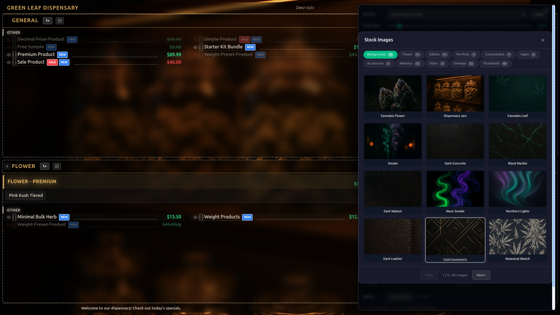
Images are organized into categories:
| Category | Count | Description |
|---|---|---|
| Backgrounds | 66 | Full-page backgrounds: dark textures, abstract patterns, nature scenes, geometric designs, neon aesthetics, and more. |
| Flower | 12 | Cannabis flower photography: buds, trichomes, jars, greenhouse shots. |
| Edibles | 11 | Gummies, chocolate, brownies, candy, capsules, beverages. |
| Pre-Rolls | 7 | Joints, blunts, cones, infused pre-rolls. |
| Concentrates | 7 | Shatter, live resin, diamonds, budder, rosin, hash. |
| Vapes | 5 | Vape pens, cartridges, disposables, pod systems, desktop vaporizers. |
| Accessories | 7 | Grinders, pipes, bongs, rolling trays, dab tools, stash jars. |
| Wellness | 12 | Topicals, tinctures, beverages, CBD products, bath bombs, seeds. |
| Other | 3 | Miscellaneous product images. |
| Overlays | 55 | Transparent overlay images: leaf silhouettes, smoke wisps, botanical illustrations, geometric frames, sparkle effects, neon borders. |
| Thumbnails | 45 | Small product icons for individual product type representation. |
The browser shows 12 images per page with pagination. Click any image to set it as the background. Use the category tabs at the top to filter by image type.
More detail: running several TVs
Multi-Screen Setup
For stores with multiple TVs, you can show different product categories on each screen. There are two approaches:
Approach 1: Separate Templates (Recommended)
Create a dedicated template for each TV with its own category selection. This gives you full control over layout, timing, and categories per screen.
| TV | Template | Categories |
|---|---|---|
| TV 1 (main) | "Main Floor" (default) | All categories |
| TV 2 (flower wall) | "Flower Wall" | Flower, Pre-Rolls |
| TV 3 (edibles case) | "Edibles Display" | Edibles, Beverages |
Each TV loads its template URL:
TV 1: /pos?display=menu-board
TV 2: /pos?display=menu-board&template=<flower-template-id>
TV 3: /pos?display=menu-board&template=<edibles-template-id>
Approach 2: URL Category Filter
For quick filtering without creating separate templates, add the categories URL parameter:
https://yourstoreurl.brotherpos.ca/pos?display=menu-board&categories=flower,pre-rolls
| TV | URL | Shows |
|---|---|---|
| TV 1 (main) | /pos?display=menu-board | All categories |
| TV 2 (flower wall) | /pos?display=menu-board&categories=flower,pre-rolls | Flower and Pre-Rolls only |
| TV 3 (edibles case) | /pos?display=menu-board&categories=edibles,beverages | Edibles and Beverages only |
| TV 4 (vape counter) | /pos?display=menu-board&categories=vapes,concentrates,accessories | Vapes, Concentrates, and Accessories |
The categories parameter accepts a comma-separated list of category names (case-insensitive). The filter matches if the category name contains the filter text or the filter text contains the category name, so partial matches work (e.g., flower matches "Flower", edible matches "Edibles").
You can combine both approaches — use a template for base settings and add &categories= for additional filtering on top.
Saving From One TV Does Not Change the Others
A screen opened with ?template= or ?categories= is deliberately showing only part of the store. When you press Save on such a screen:
- Its categories are not written store-wide. Those belong to the template and are edited on the Menu Board Templates page. (This is what used to switch every other TV onto one TV's categories.)
- Its design is saved to whichever look that screen wears — so if you gave it its own look, only that TV changes. If it is still on the store default, every other board on the store default changes with it. See Giving a Screen Its Own Look.
The main, unfiltered board is still the one that defines the store-wide category list.
When a categories filter is in the address, the edit panel shows a green Screen row reading Filtered: followed by the filter. While you are in edit mode the filter is paused, so every category shows until you save or cancel.
More detail: what's shown for each product
Product Information Displayed
Each product on the menu board shows:
| Field | Shown When |
|---|---|
| Product Name | Always (can be overridden with a display name). |
| Price | When "Prices" toggle is on. |
| Every Variation Price | Products sold in several sizes or doses list each one as a small chip under the name — 500mg $15 1000mg $25 2000mg $40 — cheapest first. See Products Sold in Several Sizes. |
| Weight-Based Tier Pricing | Cannabis products with pricing template pricing (e.g., 3.5g, 7g, 14g columns). Shown when "Tier $" toggle is on. The weight label is drawn in its own colour so it reads apart from the price. |
| THC % | When "THC%" toggle is on and cannabis features are enabled. |
| Strain Type | Indicated by a colored bar on the left (Indica = purple, Sativa = amber, Hybrid = green, CBD = cyan). Shown when "Bars" toggle is on. |
| Pricing Template | Products grouped into tier sections (AAAA+, AAAA, AAA, Exotic) with colored chip badges. Within each tier, the strain chips are grouped by strain type (Sativa, then Hybrid, then Indica, then balanced, then CBD) so the color-coded chips cluster instead of appearing in random order. Each chip is a bounded pill with its own border and a strain-colored left edge, so adjacent names read as separate items rather than running together. |
| SALE Badge | Products currently on sale. Optional pulse animation. |
| NEW Badge | Recently added products (configurable days threshold). |
| PICK Badge | Staff pick products. |
Products with no stock are left off the board, unless Show out-of-stock products is turned on under Settings → Edit Settings → Sales & Integrations → Digital Menu Boards.
Products Sold in Several Sizes
A product with variations — 500mg / 1000mg / 2000mg gummies, small / medium / large, and so on — used to show a single "From $15.00", which tells a customer the least useful thing about it.
Every variation's own price now appears as a row of small chips directly under the product name, cheapest first:
Sour Cherry Gummies
500mg $15.001000mg $25.002000mg $40.00
The chips stay welded to their product, so a column break can never strand a price list under the wrong name. "From $X" is still used as a fallback for the rare case where the variation prices are not available.
Size the chips with the Variations slider in Field Sizes. They follow the Prices toggle — turn prices off and the chips go with them.
How Products Are Grouped Inside a Category
Within a category card, products that are not on a weight-price band are grouped by strain type — Sativa, then Hybrid, then Indica, then CBD, then anything with no strain set.
Anything with no strain sits in a group called Other. On a Flower board that label earns its place next to Sativa/Hybrid/Indica. On boards where nothing has a strain — concentrates, edibles, and every non-cannabis store — the board no longer draws a pointless "Other" heading over the whole list: when there is only one group, there is nothing to tell apart, so it goes unlabelled. That also gives the column back a line of height for an extra product.
Category cards also sit with a visible gap between them so the board reads as a set of menus rather than one long list. The gap grows with the type size, so the spacing stays in proportion however large the board renders.
More detail: how the board sizes itself, paging and updates
How the Board Sizes Itself
You do not lay the board out by hand. Every time the menu or the screen changes, the board:
- Measures the screen and works out how many columns of a readable width will fit across it.
- Measures the cards it just drew — how tall each category actually turned out, with its price bands, its wrapped names and its variation chips.
- Chooses the column count and the type size together. More columns hold more, so the type can be bigger, but the last columns end up short; fewer, wider columns fill better but force the type down. The board picks whichever combination covers the most screen at the largest readable size.
- Packs the cards down the columns. A category with four price bands takes the room it needs and one with a single item takes a line — no category is squeezed into a box the same size as its neighbour's.
- Grows the type if there is room left over. Twenty-three rows of product in room for forty gets bigger type, not a blank bottom third of the screen. Spacing rows apart to reach the bottom reads as a bug; bigger type reads as designed and is easier to see from across the room.
- Shrinks the type if the board still overflows, one small step at a time, until nothing runs off the bottom or off the right-hand edge. When cards are packed down the columns, a menu that is slightly too long spills into an extra column past the edge of the screen rather than off the bottom, so the board checks both directions. This is the safety net that keeps the last categories from being cut off no matter how unusual the content is.
Your Font Size slider then applies on top as a share of that fitted size, and it can only ever make things smaller than the fit — never larger. That is why no setting can push products off the screen.
A few consequences worth knowing:
- The board settles and then stays put. Once it has fitted itself it stops re-measuring. The periodic product refresh does not re-lay the board out unless the products, prices or names actually changed. A board left alone on a wall keeps exactly the size it settled at.
- All columns use the same type size, set by the fullest column, so the board reads as one menu rather than a patchwork.
- Widening a column can grow the type. Column width is what decides whether a long product name fits, so a board with fewer, wider columns can carry larger type than one with many narrow ones.
- A single-category board fills the screen. A TV showing only Concentrates gets the full width, and splits into two sub-columns only when one column cannot hold the list.
Auto-Paging (When the Menu Will Not Fit)
If the menu is too dense to fit on one screen even at the smallest readable size, the board stops trying to shrink — a board nobody can read from across the room is no use — and goes back to cycling. Categories are laid out in equal cells and each column pages through its own products:
- Each column manages its own page cycle independently.
- Each page shows for the template's Page Duration.
- Dot indicators in the category header show which page is currently displayed and the total page count.
- Pricing template sections (AAAA+, AAAA, etc.) always appear on the first page, with additional non-tiered products flowing onto subsequent pages.
This per-column paging is independent from board-level Page Rotation, which cycles the entire board between groups of categories. See Page Rotation for boards with more categories than fit on one screen.
Cycling means the menu genuinely does not fit. Give it less to show: split the categories across more TVs (see Multi-Screen Setup), turn Page Rotation on so each page carries fewer categories, or hide slow-moving products with Show/Hide.
Real-Time Updates
The menu board updates automatically:
- Price changes — Updated on the next refresh cycle.
- Stock changes — Out-of-stock products disappear; restocked products reappear.
- New products — Appear on the board after the next refresh cycle.
- Product edits — Name, THC/CBD, tier, and other field changes reflect after the next refresh.
- Sale campaigns — Products entering or leaving a sale campaign update their badges automatically.
The menu board requires an active internet connection on the display device. If the connection drops, the last loaded data remains visible, but updates will not appear until connectivity is restored.
More detail: troubleshooting and good habits
Troubleshooting
| Issue | Solution |
|---|---|
| Menu board is blank | Check that products are set to Active and have stock (or turn on Show out-of-stock products). Verify the URL is correct. |
| "Menu Board Unavailable" error | Check that Enable Digital Menu Boards is on, that the Menu Board Templates page has at least one active template, and that the display device is connected to the internet. |
| Prices not updating | Verify connectivity. The board refreshes on a configurable interval (default 5 minutes). Reload the page for an immediate refresh. |
| Text too small on a large TV | Enter edit mode and set Font Size to 100% — that fills the screen. To push a single field further, raise the Name multiplier in Field Sizes. |
| Menu sits small with black space around it | Font Size is below 100%. Drag it to 100%. |
| Type looks huge on a nearly empty board | The board grows the type to fill the screen when there is little to show. Add more categories to that TV, or lower Font Size. |
| Products cut off at the bottom of a card | Should not happen — the board shrinks the type until nothing overflows. If you see it, reload the page so the board re-measures, and check whether a Field Sizes multiplier has been pushed very high. |
| Board keeps resizing or flipping layouts | Reload the page. The board is supposed to settle once and stay put; if it does not, note what is on that board and report it. |
| Board slowly shrank over the day | Fixed. Reload once and it will hold its size from then on. |
| Prices blank on every row, but weight bands still show prices | Turn the Prices toggle in edit mode on, then Save. The store-wide Show prices setting (Settings → Edit Settings → Sales & Integrations → Digital Menu Boards) is only the starting point — each board decides for itself once you press the toggle. |
| One TV's changes appear on all the other TVs | They are all sharing the store's default look. Go to the Menu Board Templates page and click Own look on the screens that should differ. See Giving a Screen Its Own Look. |
| Every TV shows the same categories, whatever template it loads | A store-wide category filter is overriding them. Clear it from the amber banner on the Menu Board Templates page — see Getting Out of a Store-Wide Category Filter. |
| Every group is labelled "Other" | Fixed — a lone strainless group is no longer labelled. Reload the board. |
| Screen goes to sleep | Adjust the display device's power and screensaver settings to disable sleep. |
| Browser toolbar showing | Press F11 for full-screen mode, or launch Chrome in kiosk mode. |
| Background image not loading | Check that the image URL is correct. Stock images use paths starting with /images/menu-board-stock/. Custom URLs must be publicly accessible. |
| Changes not saving | Only a signed-in admin, manager or owner can save — if the Edit button is missing, you are not signed in on that device. Settings are saved to the look that screen wears. |
| Category filter not working | The categories URL parameter is case-insensitive and uses partial matching. Check for typos. Example: &categories=flower,edibles |
| Wrong categories showing | Check the category priority: store-level settings override template settings. Each template card on the Menu Board Templates page says whether its list came from the store filter, the template, or is showing all. |
| Template not loading | Verify the template ID in the URL is correct. On the Menu Board Templates page, check the template exists and is not marked Inactive. |
| Edit button not visible | The Edit button only appears for a signed-in admin, manager or owner of the store. Make sure you are signed in (on the POS register or in the admin) on the device viewing the board. See Edit Mode. |
| Strain names clipped on a 720p TV | Long names now wrap onto a second line automatically. If names still feel cramped, lower the Name field size or enable Page Rotation to spread categories across pages. |
Best Practices
- Start from a preset look — If your store has the preset looks, pick the closest match and customize from there.
- Use a dark theme — Dark backgrounds are easier to read in retail environments, produce less glare, and look more premium.
- Overlay opacity of 60–80% works best — When using a background image, the overlay darkens it enough to keep text readable without completely hiding the image.
- Glass morphism pairs well with image backgrounds — The frosted glass effect on category columns adds depth when there is a visible background image behind them.
- Neon mode + dark background — For a modern dispensary vibe, use the Neon Nights profile or enable Neon text effect with a dark background.
- Use leader dots for price lists — When showing prices, leader dots create a clean visual line from product name to price, similar to a restaurant menu.
- Use category filters for multi-TV setups — Dedicate each TV to specific categories so customers see relevant products without information overload.
- Use a dedicated device — Do not use the menu board device for other tasks. A device that only runs the menu board is the most reliable.
- Give each TV its own look before you tune it — One click of Own look on the Menu Board Templates page and that screen stops dragging the others along with it.
- Leave Font Size at 100% — That is what fills the screen. Only drop it if you want the menu to sit smaller on purpose.
- Let the board size itself — The automatic fit is nearly always better than a hand-set Grid. Reach for manual columns only when you have tried the automatic result and disliked it.
- Check from the customer's perspective — Stand where customers stand and verify readability. Adjust font size accordingly.
- Power cycle weekly — Restart the display device weekly to prevent browser memory buildup.
- Use the QR code — Adding a QR code to your online menu lets customers browse details and place online orders from their phone while they wait.
- Leave anti burn-in on — Keep Pixel Shift enabled and set Off-Hours Dim to your closed hours so an always-on panel does not develop burn-in. See Screen Care.
- Set the Safe Area at install — If your TV crops the edges, nudge the Safe Area slider until the menu sits fully inside the screen. This avoids fiddling with the TV's own overscan setting.
- Rotate pages on crowded boards — For stores with many categories, Page Rotation keeps each page readable instead of shrinking everything to cram it onto one screen.
What's Next?
- Kitchen Display — Set up a display for order preparation areas.
- Label Templates — Print physical labels for products shown on the menu board.
- Managing Products — Manage the products that appear on the menu board.