Navigating the POS
The POS Register is the heart of your daily sales workflow. This guide takes you on a complete tour of every element on the screen so you know exactly where everything is and what it does.
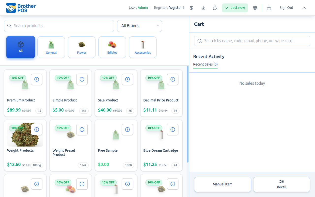
The POS Layout
When you log in to the POS at storename.brotherpos.ca/pos, you will see a screen divided into three main areas:
- Header bar across the top — store/register info and action buttons
- Product area on the left — search bar, category tabs, and product grid
- Cart panel on the right — customer search, cart items, and checkout
Header Bar
The header bar runs across the top of the screen with key information and action buttons.
Store and Register Info
The left side of the header shows:
- User — The name of the currently logged-in cashier
- Register — Which register this session is assigned to (e.g., "Register 1")
Action Buttons
The header contains several action buttons:
| Button | Purpose |
|---|---|
| Open Cash Drawer | Manually trigger the cash drawer to open (requires manage_cash_sessions permission) |
| Cash Drop | Record a cash removal from the drawer during your shift (requires manage_cash_sessions permission) |
| Sync indicator | Shows when the POS last synced with the server (e.g., "Just now") — tap to see sync details |
| Printer Settings | Configure receipt and label printer connections for this device |
| Lock / Switch User | Lock the register and show the PIN entry screen so another cashier can log in |
| Sign Out | Fully sign out of the POS register |
| Collapse Header | Minimize the header to give more screen space to products |
On smaller screens, tap Collapse Header to hide the action buttons and maximize the product grid area. The header expands again when you tap it.
Category Bar
Below the search bar, a row of category buttons lets you filter the product grid.
How It Works
- Tap a category to filter the product grid to only show products in that category.
- Tap "All" (the first button) to remove the filter and show all products.
- Categories are displayed in the order configured by your admin.
- The currently selected category is visually highlighted.
- Categories may include emoji icons for quick visual identification (e.g., 🌿 Flower, 🍪 Edibles, 💨 Vapes).
Example Categories
Depending on your store's configuration, you might see:
| Button | Shows |
|---|---|
| All | Every product in the catalog |
| 🌿 Flower | Dried cannabis flower |
| 🚬 Pre-Rolls | Pre-rolled joints and packs |
| 💨 Vapes | Cartridges, disposable pens |
| 🍪 Edibles | Gummies, chocolates, baked goods |
| 🧴 Topicals | Creams, balms, lotions |
| 🔧 Accessories | Grinders, papers, pipes |
| 🥤 Beverages | Cannabis-infused drinks |
Memorizing which category a product belongs to is one of the fastest ways to improve your speed at the register. Instead of searching by name every time, tap the category and find the product visually.
Product Grid
The product grid is the largest area on the screen, taking up the left side. It displays products as cards that you can tap to add to the cart.
Product Cards
Each product card shows key information:
- Product name — The primary identifier
- Price — The selling price (shows both sale price and original price if on sale)
- Sale badge — A colored badge showing the discount (e.g., "10% OFF") if the product is part of a sale campaign
- Stock count — The number of units or grams available
- Cannabis info (if enabled) — THC/CBD percentages and strain type badge (Indica, Sativa, Hybrid, CBD)
- Category emoji — A small icon indicating the product category
- Info button — Tap the "i" button to view detailed product information
Interacting with the Grid
- Tap a product card to add one unit to the cart. For weight-based products, a weight selection panel appears.
- The grid scrolls vertically if there are more products than fit on one screen.
- A product count is displayed at the bottom (e.g., "29 products").
- A "Cached" indicator shows that the product catalog is available offline.
Search Bar
The search bar is located above the category tabs at the top of the product area.
Text Search
- Tap the search bar (placeholder text: "Search products...").
- Start typing the product name.
- Results filter in real time as you type.
- Tap the matching product to add it to the cart.
- Clear the search to return to the full product grid.
Barcode Scanning
If your register has a USB barcode scanner:
- Make sure the POS is the active window (the search bar does not need to be focused).
- Scan the barcode on the product.
- The scanner sends the barcode number as keystrokes, and the POS automatically matches it to a product.
- The product is added to the cart instantly.
You do not need to click the search bar before scanning. The POS listens for barcode input at all times. Just point the scanner at the barcode and squeeze the trigger — the product appears in the cart.
Search Tips
- Search works on product names, SKUs, and barcode numbers.
- Partial matches work — typing "blue" will find "Blue Dream".
- Search is case-insensitive — "BLUE" and "blue" return the same results.
- Clear the search field after finding your product to restore the full grid.
Cart Panel
The cart panel occupies the right side of the screen. This is where you build the current transaction.
Customer Search
At the top of the cart is a customer search bar where you can look up customers by name, email, phone number, loyalty code, or swipe their card. Attaching a customer to a sale:
- Earns them loyalty points
- Applies their tier discount automatically
- Tracks the purchase in their history
- Ensures compliance with daily purchase limits (for cannabis stores)
Cart Items
When products are added, each item in the cart shows:
- Product name — What was added
- Quantity — How many units (with controls to adjust)
- Line total — The price for this line (unit price x quantity)
- Discount — If a discount was applied to this line, it shows the amount off
Cart Summary
Below the item list, the cart summary shows:
| Line | Description |
|---|---|
| Subtotal | Total before tax and discounts |
| Discount | Total discount applied (if any) |
| Tax | Tax amount with the rate percentage |
| Total | Final amount the customer owes |
In split tax mode (GST/PST), the tax line breaks into separate GST and PST amounts.
Recent Activity
When the cart is empty, the cart panel shows a Recent Activity section with your recent sales for the day. This lets you quickly check the last few transactions.
Quick Action Buttons
Below the cart, buttons provide quick access (these appear when the cart is empty):
- Manual Item — Add a custom item to the cart with a name and price (useful for items not yet in the catalog)
- Recall — Bring back a previously held/parked cart
- Payout — Record a cash payout from the register (when payouts are enabled)
POS Settings
Tap the gear icon or access settings from the header to open the POS Settings panel. Here you can customize the register for your device:
Display Settings
Toggle these options on or off to customize what appears on product cards:
| Setting | Description |
|---|---|
| Show product images | Display product photos on cards |
| Show prices on product cards | Show prices directly on the grid |
| Show stock levels | Display remaining stock count |
| Show sale/discount badges | Show sale badges on discounted products |
| Show category icons | Display emoji icons for categories |
| Show cannabis details (THC/CBD) | Show THC/CBD percentages |
| Show cash drawer button in header | Show the Open Cash Drawer button |
| Show product info button on cards | Show the info "i" button on product cards |
| Show brand on product cards | Display the brand name |
These settings only affect this device's display — they do not change what other registers see.
Language
Switch the POS interface language:
- English
- Français (French)
- Español (Spanish)
- हिन्दी (Hindi)
- ਪੰਜਾਬੀ (Punjabi)
Quick Actions
The settings panel also provides quick-access buttons:
- Report Product Issue — Flag a problem with a product (manager and admin only)
- Start Demo Tour — Launch a guided walkthrough of the POS
- Open Admin Panel — Switch to the admin interface (manager and admin only)
- Get Support — Submit a support request
Register Lock Screen
When you step away from the register, lock it to prevent unauthorized use:
- Tap the Lock / Switch User button in the header.
- The screen is replaced with the PIN entry keypad.
- To unlock, enter your PIN (or any authorized user's PIN to switch cashiers).
The locked register does not end the cash drawer session — the drawer stays open and transactions are preserved.
Even for a quick bathroom break, lock the register. It takes two seconds and prevents anyone from processing sales under your name.
Payment Screen
Payment method buttons (CASH, DEBIT, etc.) are directly visible in the cart panel below the cart totals. Tap a payment method to begin the payment flow.
Payment Methods
| Method | Description |
|---|---|
| Cash | Enter the amount tendered; the system calculates change |
| Debit | Customer pays with debit card on the terminal. When a payment terminal is configured, the payment is sent to the terminal for processing. |
| E-Transfer | Customer pays via e-transfer (if enabled) |
| Store Credit | Customer pays using a pre-loaded store credit balance (when enabled in store settings) |
| Gift Card | Customer pays using a gift card balance (when gift cards are enabled) |
| Split | Split the payment across multiple methods |
Cash Payment Flow
- Tap "Cash".
- Quick amount buttons appear ($10, $20, $50, $100). When no amount has been entered, the main completion button shows "Exact" to record the sale for the exact total.
- Tap a quick button or type the exact amount the customer gave you.
- The change due is displayed prominently.
- Tap "Complete" to finalize the sale.
Card Payment Flow
- Tap "Debit".
- The customer processes their card on the payment terminal.
- Once the terminal confirms the transaction, tap "Complete".
Split Payment Flow
- Tap "Split".
- Select the first payment method and enter the amount.
- Select the second payment method for the remaining balance.
- Complete each portion.
If a customer wants to pay $20 in cash and the rest on debit:
- Tap Split.
- Select Cash, enter $20.00.
- The remaining balance appears.
- Select Debit for the remainder.
- Complete the sale.
Weight Selection Panel
When you add a weight-based product (common for cannabis flower), a special panel appears:
Preset Weights
Quick buttons for common weights:
| Button | Weight |
|---|---|
| 1g | 1 gram |
| 3.5g | Eighth (3.5 grams) |
| 7g | Quarter (7 grams) |
| 14g | Half ounce (14 grams) |
| 28g | Full ounce (28 grams) |
Custom Weight
- Tap "Custom" to enter an exact weight using the number pad.
- Useful for products that are not sold in standard increments.
Scale Reading
If a scale is connected:
- Place the product on the scale.
- Tap "Read Scale" to pull the weight automatically.
- The weight populates in the field and the price is calculated.
The price is calculated automatically: weight x price per gram. The per-gram price is set in the product's configuration in the admin panel. Quality tier pricing may affect the per-gram price.
POS on Different Devices
The POS is designed to work on various devices:
Touch Register (Recommended)
- Full touch interaction with the grid and cart
- Optimal screen size: 10" to 15"
- Works in landscape or portrait orientation (landscape recommended)
Tablet (iPad, Android)
- Fully functional with touch
- Install as a PWA for full-screen mode
- Landscape orientation recommended for the best layout
Desktop Browser
- Works with mouse and keyboard
- Barcode scanner support
- Not touch-optimized but fully functional
The ideal POS setup is a touchscreen display (10-15 inches) in landscape orientation, with a USB barcode scanner and a network receipt printer. This gives cashiers the fastest, most natural workflow.
Age Verification Prompt
If age verification is enabled, the POS displays an age gate prompt when age-restricted products are added to the cart (or at checkout, depending on the verification mode). The cashier must confirm that the customer meets the minimum age requirement before proceeding.
POS Idle Timeout
If the POS register is idle for an extended period, it may automatically lock the screen and display the PIN entry keypad. This prevents unauthorized access when the register is unattended. The timeout behavior follows the same flow as manually locking the register.
What's Next?
- POS Quick Start — Practice your first sale step by step.
- Making a Sale — The complete sales workflow in detail.
- Gift Cards — Activate and redeem gift cards.
- Language & Theme — Customize the POS appearance.
- Logging In — Understand PIN login and session management.